Mining Graphic Design
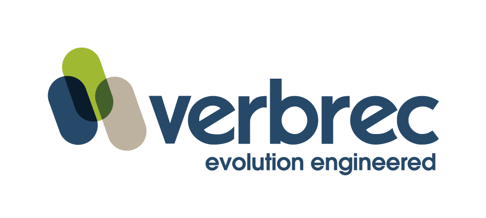
Verbrec
“I cannot say enough positive things about the team at Ignition Creative. They have provided excellent services on my last two projects (one of which was a large company rebrand), and I shall be using them into the future. Many thanks to Ignition Creative.”
– Brian O’Sullivan
Non-Executive Director (AM)
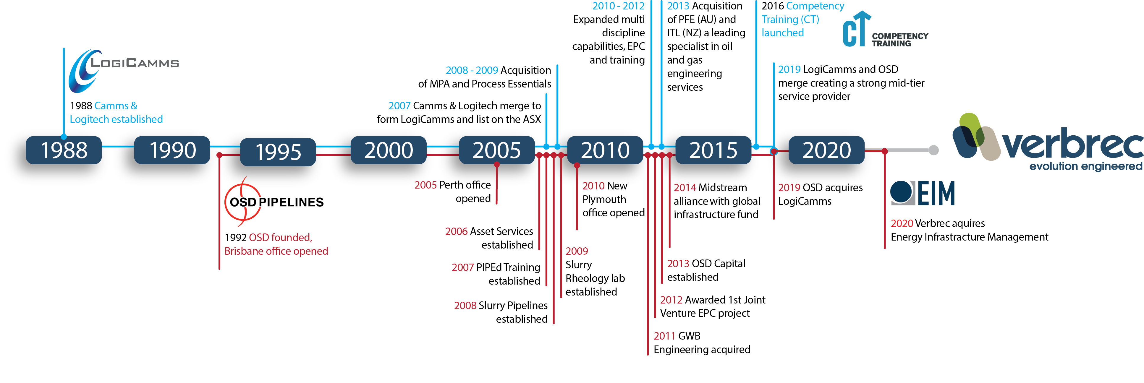
LogiCamms Limited engaged Ignition Creative as mining graphic design experts to create and develop a new name and brand for their parent company. This entity was created from three engineering and operations companies working in minerals and metals, hydrocarbons, water, infrastructure and industry training.
A newly defined parent company and group structure would allow the three companies to capitalise on their combined individual brand equity and any potential future acquisitions.
With offices throughout Australia and New Zealand delivering projects globally across multiple sectors for more than 23 years, the new brand had to encapsulate diverse industry deliverables and personalities.
In addition, the new business name also had to be a dot-com registerable domain. And the brand needed to represent the industry sectors that all their companies worked within, while encapsulating the organisation’s ethos and the solutions it provided for their customers globally.
The rebrand
The name Verbrec is derived from a combination of Nordic words meaning ‘person’ and ‘strength’. Verbrec will present future acquisitions as subsidiaries and reference them as such on the website and literature to maintain brand equity. This equity may transition to just Verbrec over time.
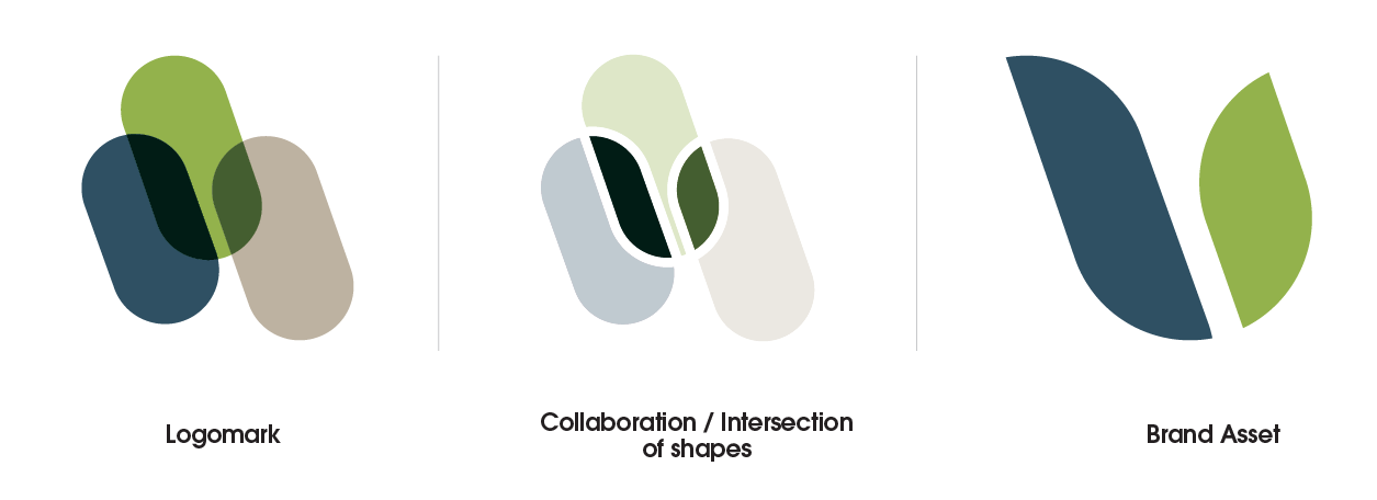
Brand asset — “the leaves”
We envisioned the overlay of the three stadium shapes to create “the leaves”. This is a key brand asset Verbrec will use across all its branded material.
The leaves shape is a direct representation of the collaboration, flexibility, innovation, responsive and adaptability within Verbrec.
Being a direct component of the Verbrec logo, the shape and form of the leaves follow the same incline as the logomark.
The parallel leaves follow the same rationale as the logomark while also introducing a softer more organic aspect.
It reinforces the environmental consciousness of Verbrec. The clean, contemporary minimal shape and form of the leaves represent a simple and precise outcome.
The leaves also represent the ‘v’ of ‘Verbrec’ in a stylised and clean form.
The manner that we, and the Verbrec team, execute and use of the leaves can vary as the composition and shape define its brand association.
Verbrec Evolution
Mining Graphic Design Services Offered
Name Development
Market Research
Logo Development
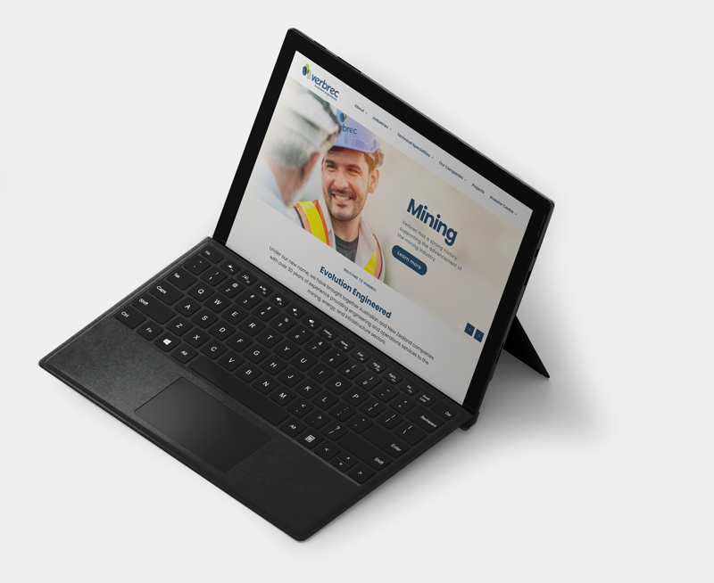
Website Development
Template Design
Interactive PDF Design